Fontana ~A long form generative art project by Harvey Rayner | patterndotco
Fontana : Latin for fountain
Companion article explaining the innovative approach to generative color used in FontanaCore theme
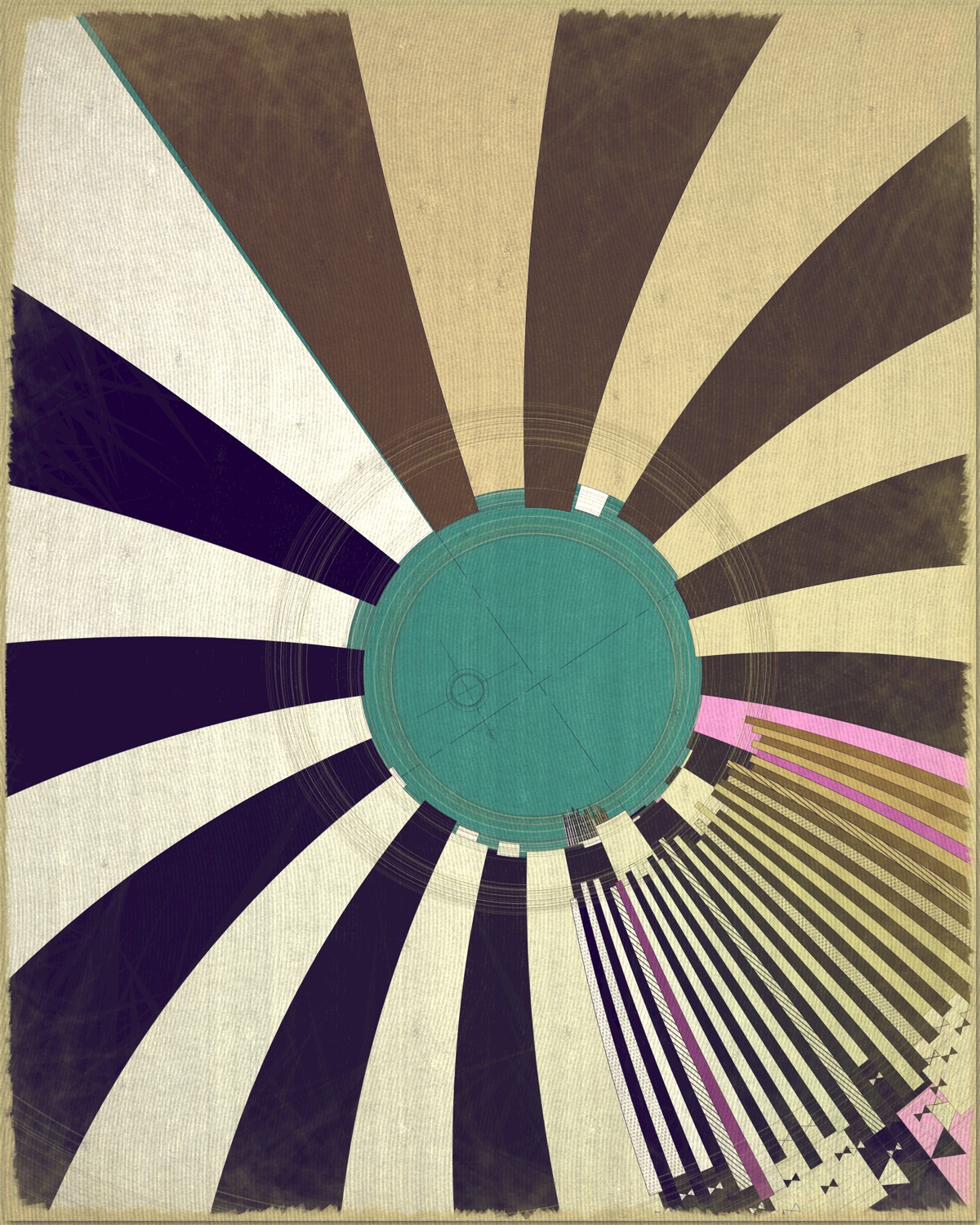
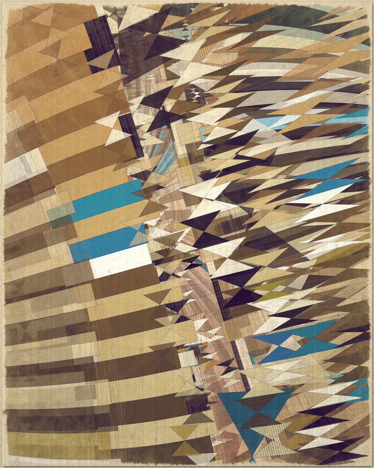
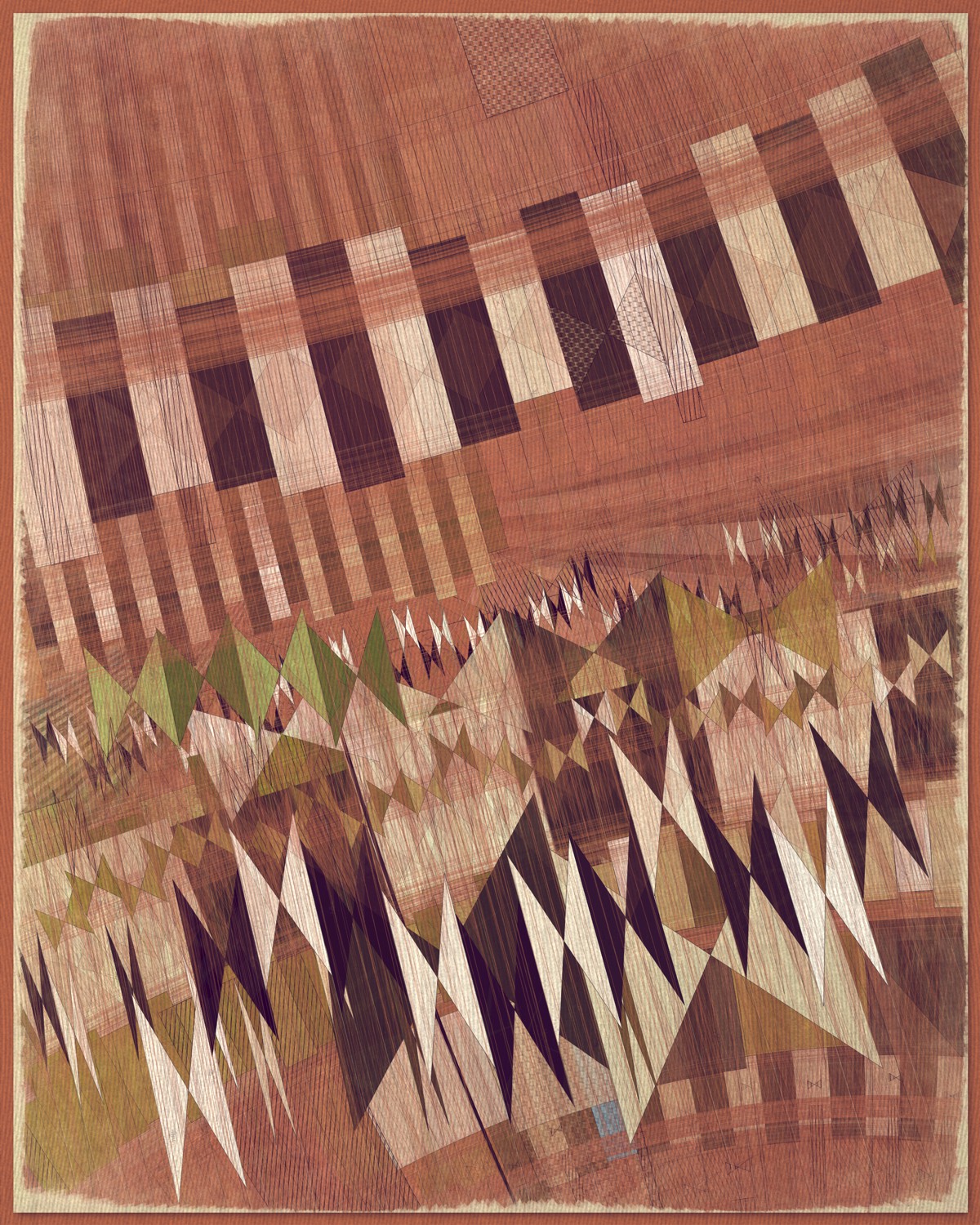
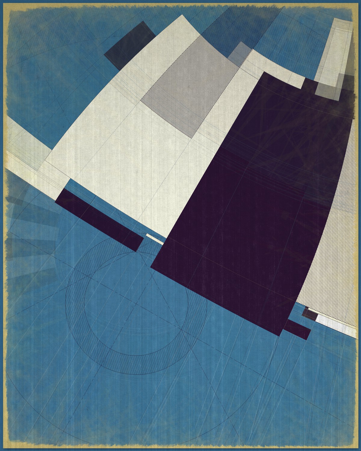
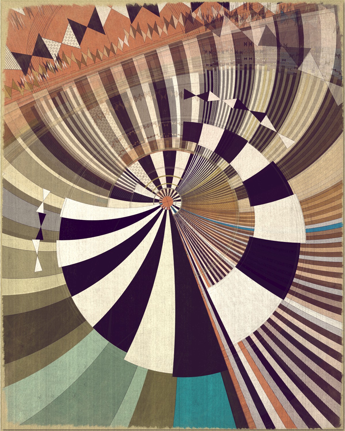
Fontana is a playful attempt at abstractly capturing the flowing movement of a fountain using precisely drawn elements that evoke a static and considered rendering of a subject that is in constant flux. The visual language is reminiscent of hand-draughted technical drawing, a precise and methodical practice that progresses at a radically different pace to the flowing and capricious movement of water. To increase this tension between dynamic motion and static mechanical process I wanted the surface textures to appear worn and aged like a drawing that has spent its life in the bottom of a mechanics drawer. This process of abrasion and discoloration is occurring on yet another scale of time adding complexity to the references of time passing.
Fontana and Futurismo
The generative color algorithm at the heart of this project was designed to create color expressions reminiscent of early 20th century media, or at least the sense we have of that era through the aged art and design artifacts that we see today. This is a period of time that saw an artistic and social movement that originated in Italy called Futurism (Italian: Futurismo). This movement set out to reflect the new rapidly shifting possibilities promised by the emerging age of machines with everything obsolete being rejected. In the visual arts the movement sought to find a new visual language that emphasized dynamism, progress and movement. I feel there is an obvious parallel with Futurism and the type of dynamism we see today in many generative projects. Futurism might be to the Industrial revolution, what generative art is to the communication age, or maybe specifically the new web3 epoch. In many ways Fontana is revisiting the same visual challenge of representing motion and change with static art. Although today we have the option of exploring motion literally with animation, I feel that to do so in this project would be to lose the tension with the key references to time in the work. Fontana is also Italian for fountain so the title is a nod to this period in art history that has been an inspiration to me for many years. The visual connection to Futurism also feeds into my decision to develop a more ‘Trad realistic’ approach to the visual language in this project. More will be said about this in a later chapter. Some outputs in Fontana are very simple, and in isolation no longer convey the original theme of a flowing fountain. However I feel these minimal outputs provide context to the more complex iterations. I see them as fountains that have slowed to a trickle or run dry completely. Special relativity from the same period as Futurism showed us that motion is relative. Without a static frame of reference movement is meaningless. Maybe I’m now stretching things too far.
Fully generative color
As previously mentioned, woven into the very fabric of Fontana is a fully generative solution for creating color expression. This means there is no reliance on preset palettes with every output being entirely unique in its coloration within the color mood of what I want the project to express as a whole. Being as I believe this approach has been relatively innovative I have dedicated an entire article to explaining the approach and presenting my view on what generative color means within the wider context of generative art.
Read full generative color article
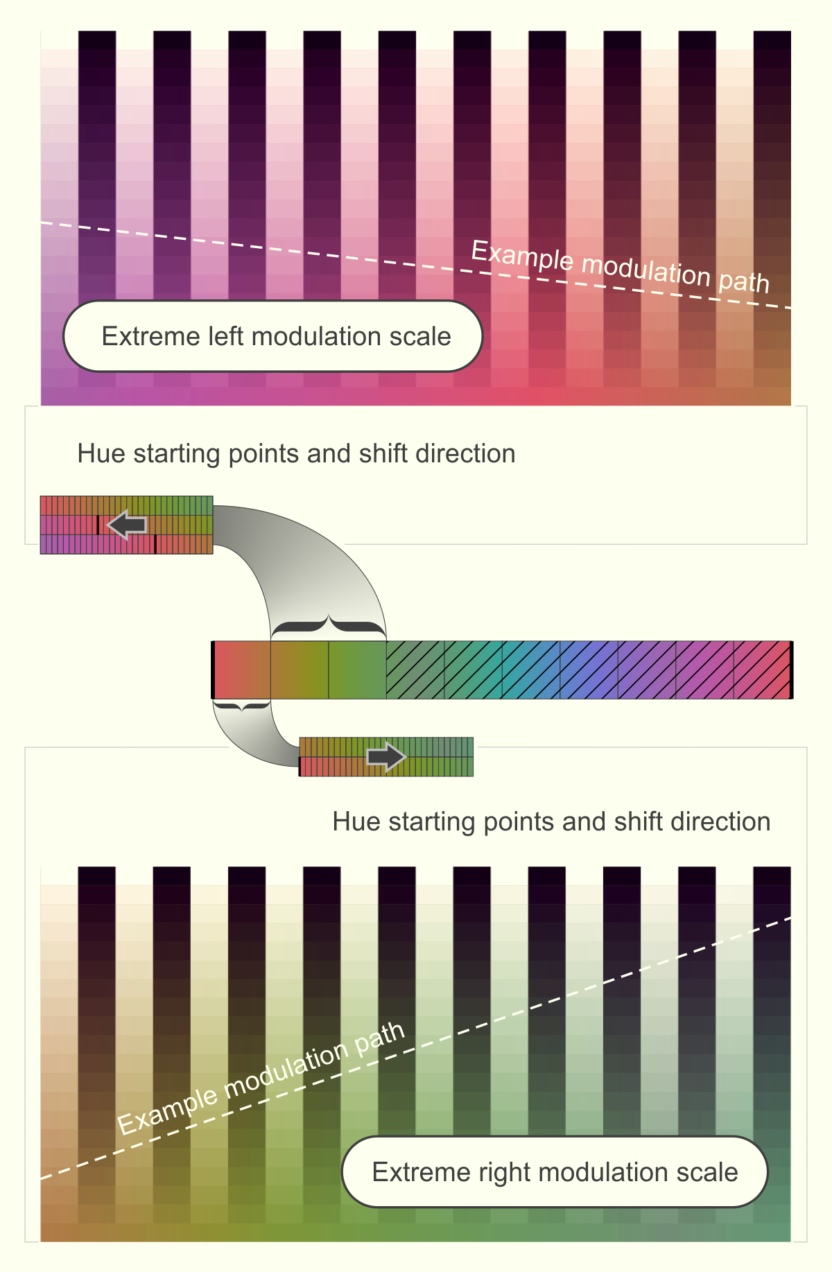
Creating a 100% generative color project has been a personal goal for many years because I feel it has the potential of evolving truly deep variety in long-form generative art. Somehow to me, using preset color palettes seems antithetical to the spirit of the Art Blocks long-form model. Finding a balance between all out boundless coloration and a distinct color expression was the most challenging part of this project and I owe special thanks to my wife and daughter for generously critiquing my outputs and pushing me to refine and refine. Having a feminine input into the project I feel helped me develop more subtlety in the color-spaces that perhaps I would have normally blasted past in the search for more forceful and high-energy color expression.
Fountain steps
Not by design but nonetheless interestingly the theme of the fountain reappears in my specific treatment of color. Some graphics software suites still use the term fountain fills instead of gradient fills. The term fountain here probably has its roots in split-fountain printing. Typically in both contexts the fountain fill is defined by the colors at each end of the gradient with the increments between being called foundation steps. This reference to fountain fills and fountain steps is perfectly apt for describing the color progressions applied to the cascading and arcing steps seen in Fontana. The color fountain reference I have to admit was a lucky coincidence, although I was aware of the term and it may have been there in my subconscious when thinking about the name for this project.
Trad realism
This project began its life with an essay I attempted to write about what I am calling Trad Realism, which I define as a sub movement within the emerging genre of generative art. Trad Realism as I am defining it is a trend of intentionally producing generative art that imitates traditional art and design. This is in distinction to a broader definition of realism or skeuomorphism where art can imitate the appearance of objects or phenomena outside of the domain of art. So Trad Realism is not referring to anything outside of the canon of art but it is referring to art from another time and art created with a different process. The motivations of the artist to do this will differ greatly but a few common motives might be to create familiarity, organic richness and accessibility to an otherwise potentially mathematical and intangible artform. Creating at least the appearance of a human made mark provides a connection point into a discipline that can be unrelatable and esoteric to a general audience. However, this said, this foreignness and inaccessibility often comes with the territory of creating new artistic language that could not have been created before. So Trad realistic approaches could be critiqued as holding on to the past and missing the opportunity to evolve truly new visual language directly from the new generative methods. While I feel this is a valid criticism, there are other merits to exploring more tactile, human-made markings that make it worth the risk of offending the generative purists.
The comfort of the imperfect
I believe the appreciation of natural surfaces is hard wired into our makeup. For many years I have worked as a house remodeler and my preference has grown towards using reclaimed and worn materials and surfaces. These materials tell a story about how other humans have interacted with them. I feel this contact fosters in us a comforting sense of belonging and a connection to the past. There is also a feeling of acceptance that comes from being surrounded by the beauty of imperfection. It shows us directly that we too are beautiful and loveable with all our human foibles, physical and emotional scars and idiosyncrasies. Compare the experience of drinking tea from a handmade mug to one that has been mass produced in a factory.
Futurism, technical drawing and making a convincing lie
So on the one hand we could say Trad Realism is a lie, but that doesn’t have to be a bad thing. Picasso once said, ‘the greatest art is the most convincing lie’. I feel as long as we are aware of what we are doing then our art cannot be called inauthentic. If engineering generative art that evokes another time or medium to create art that connects more readily on a deeply human level then do it completely and unapologetically. From the inception of the project I was thinking about Futurism and the tradition of technical drawing. Once I got over any idealistic reservations I held making a project that consciously aimed to visually reference those beautiful traditions made complete sense.
Convincing lie with clues to the truth
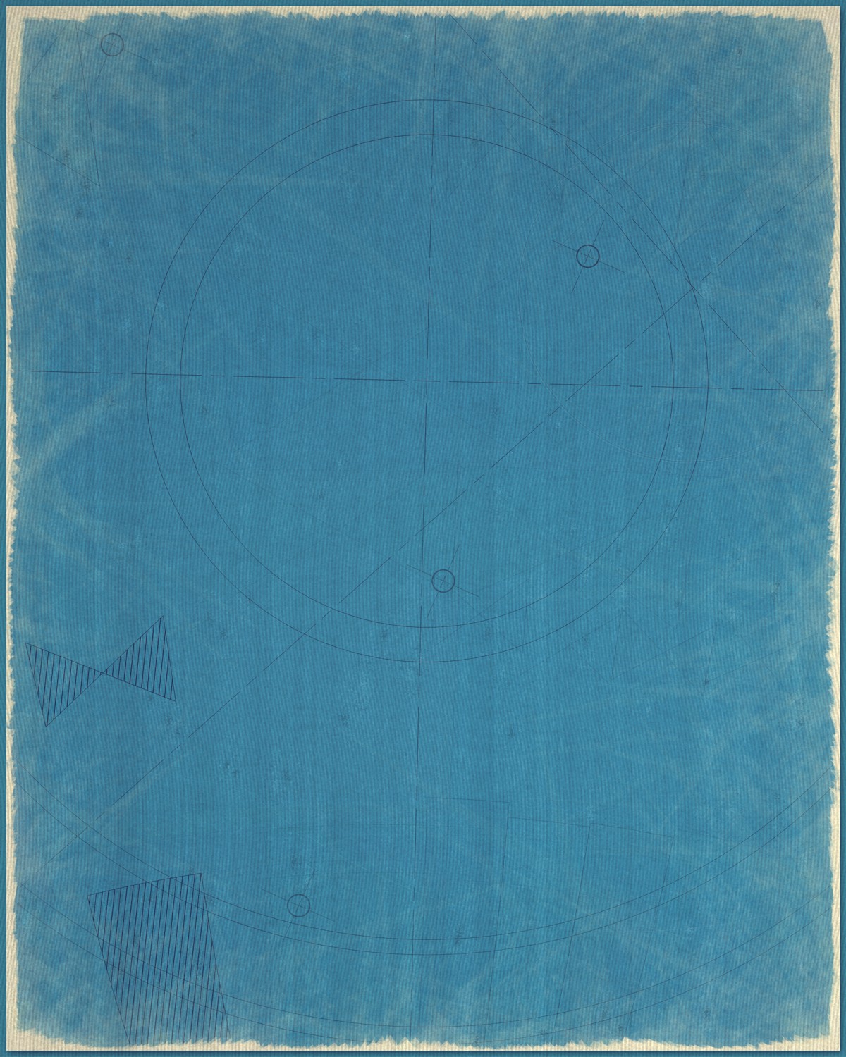
The solution I arrived at in Fontana I feel is somewhat of a hybrid approach. While I want to make the wear marks, faded palettes and hand draw stylization convincing at first glance, I do also want to leave evidence of all the actual SVG primitives used on close inspection. This done, I feel it is a more honest expression of the medium and rendering process. Within the broader context of art, keeping all generative primitives visually distinct may have a parallel to what artist’s have alluded to for decades when talking about respecting the surface of the canvas and the preservation of mark making.
Technical notes
Simplicity directness and efficiency
This project is coded with vanilla JS and SVG. The paper textures are built generatively and rendered to an additional canvas layer. I feel using P5JS or other libraries creates distance between me and the methods I use to build my work. In my process, to create something that truly reflects my own artistic voice I believe the process must start with a very clear understanding of the geometry and calculations used to render. I try to keep everything as simple and barebones as possible and this way I can fine tune my functions with a precise understanding of what the result will be on the level of constructing the primitives. The result in terms of the whole will be more of a mystery until rendered, but I feel the functions I build are as close to a physical brush or pencil as I get as a generative artist. I personally want that path to the outputs to be as direct and un-convoluted by unknown helper functions as possible.
Having the final image render in a reasonable time is also an important consideration to me. I personally find it frustrating when a generative project crashes my mobile or locks up my browser. I feel if genart is to become mainstream then we need to seriously consider the user experience and the common expectation that the modern web experience should be close to instantaneous. This opinion is probably biased by my work as a UI designer for many years and I understand it is not necessarily the view of many artists in the space.